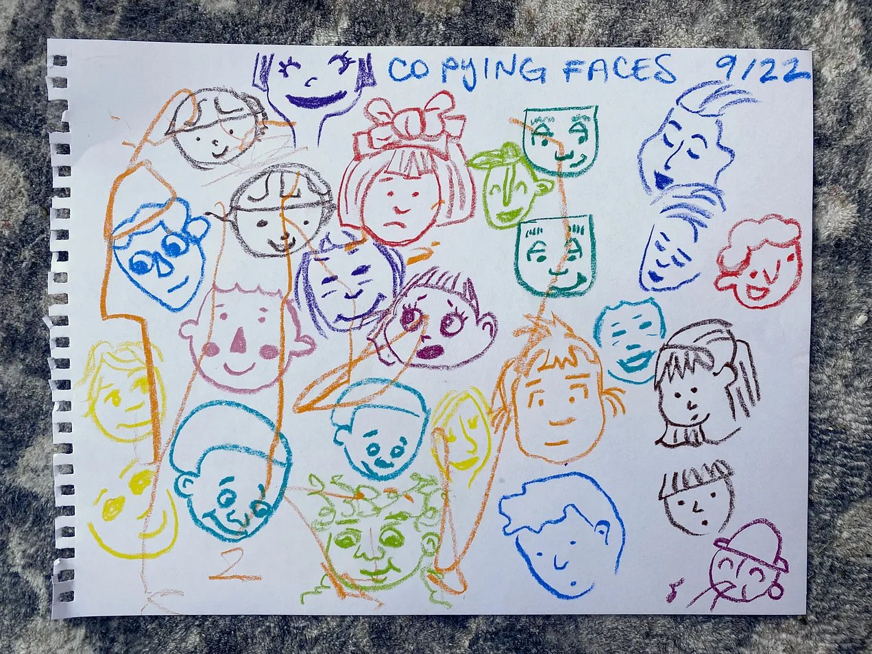
It’s pretty amazing isn’t it?
If you stop to look at an illustrated face (particularly a stylized one like those below) each of the individual lines are actually pretty simple.
It’s the way they’re all arranged that give the faces expression and character.
A few weeks ago I woke up and started writing a children's book. Just typing lines into my Notes app. We read picture books all the time so perhaps this was inevitable. 😂
I've decided to tackle my fear of drawing faces to see if I could perhaps illustrate it too.
I pulled down a stack of children’s books off our shelf and copying faces in lots of different styles. (See above.)
I obviously wouldn’t copy these in my own work, but I did this to study the lines used and see if I “could” draw stylized faces. For a first go I think I’ve done pretty well so now it’s down to practicing and developing my own style.
I started two courses for drawing people by Bardot Brush (it’s free!) and Lila Rogers (which I caught on half price.) They are both great at breaking the face down and make it all feel do-able.
Then I had another go using a minimalist approach with dots for eyes and simple mouths.
Then I added skin tones and white to the eyes.
This wasn’t an assignment, just me playing. I noticed a lot of Davy’s books illustrated the white of eyes in this way, which is very different than outlining.
I’m still not sure if I will end up illustrating this book, but it’s fun to learn something new.


