Another photo essay from my London trip.
Kew Gardens
Note from Sarah
I am experimenting with photo essays to document my London trip.
I may write more another time, but I caught COVID on the journey home and have limited capacity at the moment.
This feels like something I might have done in 2013 so maybe it’s reclaiming a lost art.
Accessibility
I cannot add alt text on mobile. Image descriptions can be found here.
Treacle Tins
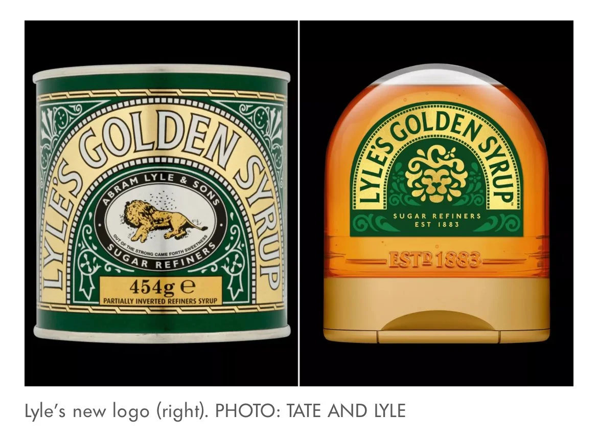
One of my favorite reads on Substack this week was Nanette Regan’s post about the new Lyle’s Golden Syrup logo.
Apparently this lion was the world’s oldest logo. And the original logo is a dead lion that Samson killed in the Bible and bees made honey in his carcass.
(Note they are only changing plastic packaging. They will be keeping the old design on the tins.)
The new lion has Aslan vibes and I like the shape of the bottle.
I have a few of these treacle tins from my time living in London to hold art supplies. It seems they aren’t changing the Black Treacle design (perhaps it only comes in a tin?) but when I was looking for it I found this.
I’d love to have one of these if anyone has a spare knocking around in their cupboards!
Winnie the Pooh
MOVIE NIGHT
Movie night: february 24, 2024
We’ve started watching new films as a family on a weekly-ish basis. It’s only over the past 6 months Davy has really developed the attention span for this (other than Totoro which he has been watching through since a babe.)
This week we watched Winnie the Pooh. I meant to watch the old version, but Disney + has updated all the thumbnails in a confusing way and we ended up watching 2011.
It drew a lot of inspiration directly fom the 1977 film. It felt like an adaptation of that film versus the books themselves. I appreciated how they continued to explore the use of text as a visual framing and storytelling device.
Something else I loved was the set and prop design in the room that opened and closed the film. This was one improvement in my opinion. The room in the 70’s version was very bright and white and clean. This one felt warm and British and lived in. I could stare for ages at the details.
Here are a few stills from the credits.
I loved how these vignettes depict the toys in scenes from the film.
That said the voice actors felt off and the story and music didn’t feel as strong. Some bits felt familiar and other bits felt “off” so we watched the 1977 version the next day to compare.
Where the 2011 film was an adaptation of the 1977 film the 1977 film was a very faithful adaptation of the original book. Over the past week we’ve been reading the original stories and it seems the 70’s film took chapters directly from the book (making minor changes for a visual format like depicting a fly as a butterfly) but remaining very true to the details of the original story.
This leads to the biggest difference between the films in that the 70s version was a vignette of small stories (quite literally chapters) where the new film tried to create an overarching narrative and shoehorn these other stories into it.
The visual framework of a book made so much more sense with this in mind. Between scenes the pages would literally ruffle and flip to a new part of the story. And the detailed animation of the text itself was more enchanting.
Pooh Gifs via Adventurelandia on Tumblr
I also love the analogue matte paintings behind the 77 version. I can see clearly that they used watercolor in a way that could never be recreated digitally.
I can’t find a good image of the backgrounds but here is one of the original cels as photographed for an auction. Maybe I should look for a book about the art of the 77 film.
While reading the book Davy wanted to know why “tiger” wasn’t on the book’s map.


